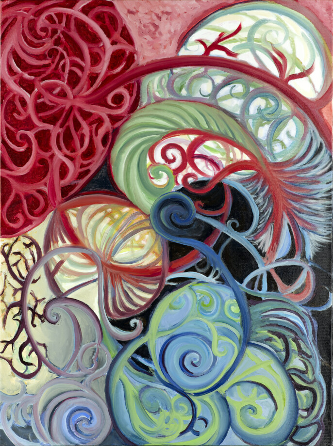
Paintings are allowed to POP! Websites, however, should not. Painting by Caroline C. Blaker, Untitled with Spirals
I remember when websites popped. It was line item number one on every RFP. It was a request on the minds of every client. It was how, as an agency or individual, your work was secretly evaluated before the potential client made themselves known, and, perhaps, how colleagues compared themselves to one-another. Portfolios of websites that would pop would, themselves, pop - and then each item would pop, and then there would be so much popping that the client would pop themselves around trying to find a way to contact you to get the project started. Halfway into development, sometimes, the same people might declare that they no longer felt that their project popped! and would ask for adjustments to be made to restore this sensational observation. Projects could go on and on, in a journey to live up to and be as good as the client once declared we were but no longer felt we could be. There is evidence to suggest that The Oatmeal may have quit his job over this, launching his comics career on its back.
It was a very confusing time.
In its newness before coming of age, web design was largely about what a designer or a developer knew how to do - and so it was more or less a contest of impressionable skill. Wow, look at this! Check that out! But this design is so pretty! Its colors POP!
We were working with a set of approximately 4 fonts, as well as IE6, and pretty much nothing mobile. Oh, and Photoshop. Arguably, most of the Pop!ing was really chasing after branding and communication in a rapidly-changing space, and details like textures, tiny gradients, and rounded corners were handled with image slicing and pixel-by-pixel placement. They were difficult to change and expensive to deploy.
Today, sites that use Trebuchet MS or tons of gradients, shadows, or 3D features look dated, because we’ve come around to relying on the words and their shape with hundreds of fonts to choose from, gentle behaviors instead of tiny details, and advanced CSS to deliver so much of what we used to rely on JS and Photoshop for. Just in time, too, because those old Photoshop websites would never scale to phones today. And developers can learn new technologies in two hours or two months and be proficient enough to rapidly deploy just about anything. It’s no longer what you know, but the efficiency of your thinking, learning, and time management. This efficiency takes experience - so the proven, shiny, Pop!'y portfolio is old and busted, and it is referrals, length of relationship, and niche building that are the new hotness, as well as the efficacy of the artifact of that relationship: the app or the website.
New hotness: websites that rise.
Are you being found online for your niche? Are you on your way? Have you given up on doing that yourself? Do you know that you could build your unique, capable business 3-4 times as big if only the volume came through? Are you relying on word of mouth referrals without reaching people outside of your network who are actually looking for you?
I hope not, but the one-time look and feel of your website, or its POP! is not going to help this.
This is a process that can take years - of dedication, of use of marketing tools, of updates.
The initial website build structure is important to the specifics of allowing you to keep your content fresh and optimized for organic search results, but the upkeep of that content is as important if not more, to earning a top position on search engines, allowing people who are looking for you without knowing you to actually find you.
New hotness: websites that talk.
Does your website communicate your message? Does it make conversion instant and seamless? Is your site set up expecting this to happen? Are you maximizing that initial 30-second window, and then the 60-second extension granted on top of that?
You have very little time to grab that stranger you just worked so hard to get and TELL THEM why you worked so hard to get them. At this point, they want to know if you are right for them. You’ll need: images, legibility, and your own authentic message. Not sure if you have this yet? We’d be delighted to help you find out.
New hotness: websites that work for you.
Can you easily update, change, move, or remove content? Can you place content where it needs to go or keep expectations fresh with updates, SEO content, new features or services, new addresses or phone numbers, or quietly shift older content away? Does the thought of doing this, or attempting it for the 100th time, scare you or induce feelings of stress?
Your website may be the shortest distance between you and the stranger looking for you, so it should reflect your voice as it changes, shifts slightly, gets excited, or stops talking. All of it! The conversation begins when your new connection makes that leap, but the conversation has been with them since they arrived at your website. Nothing’s worse than saying the wrong thing, especially when you don’t know it’s happening. The site needs to reflect what you have to say, about whatever you need to say. Furthermore, you should be able to login, make the change, and hit submit. Boom. Easy.
We’re proud that all of our clients have the chance to do this. We’re also happy to arrange to have it done for you!
The best website is the one that gets to your new customer first, and is so unobtrusive, easily navigated, legible, and clearly focused that the user does not even notice that it’s there. It doesn’t need to POP! and perhaps it shouldn’t POP! It should be designed to lead the customer straight to you, and get out of the way.