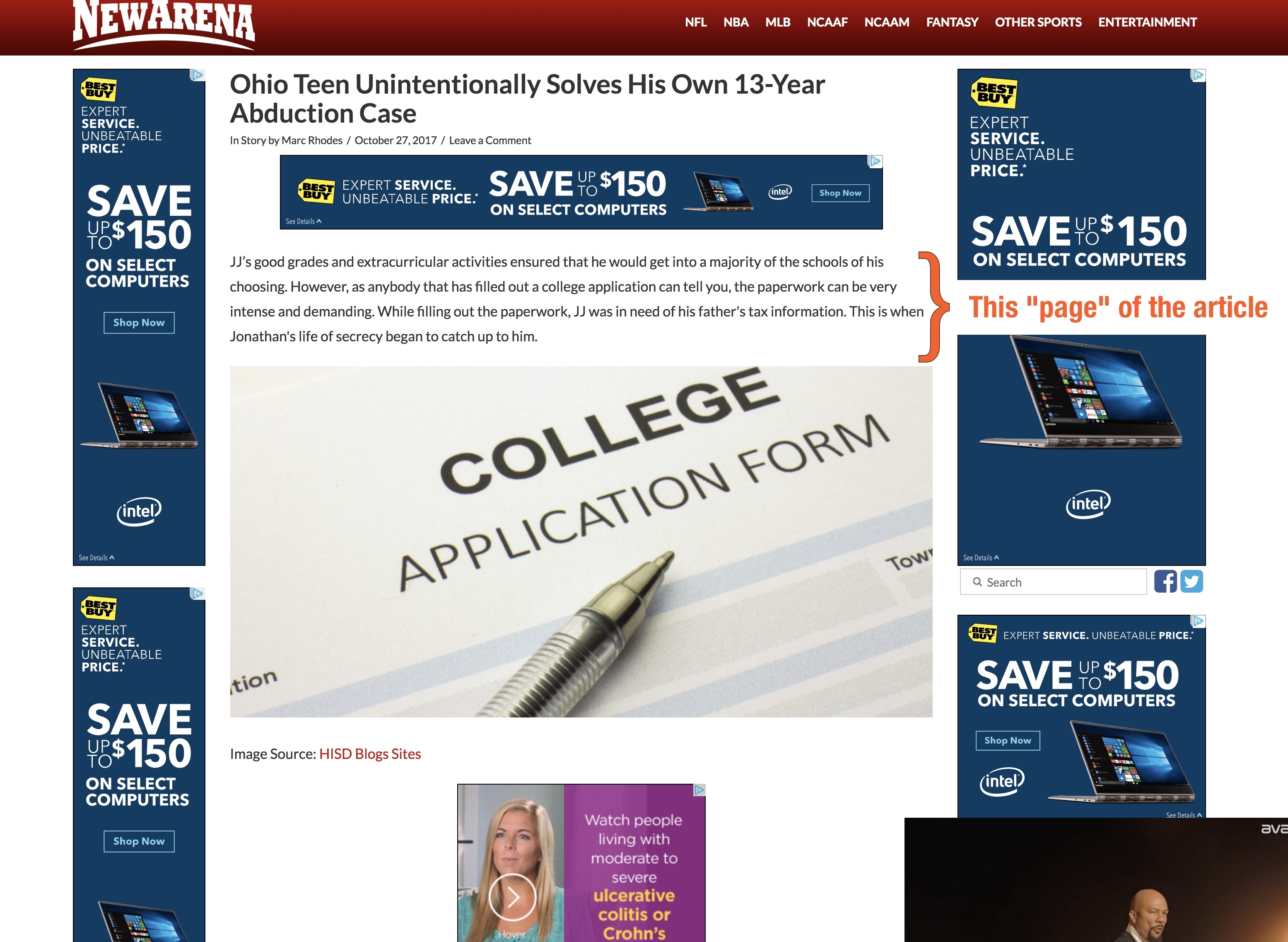
Don't do this. Don't ask me to do this.
Hey friends, gather 'round. I know it's fashionable, these days, to put the point of a piece of writing at the bottom and make you read the whole thing and try to enjoy yourself until you get to the bottom, but I'm not going to waste your time. Do not pursue web designs that are so cluttered with ads and so illegible and clicky that they reek "we hate our readers." If you are interested in my take on why this is such a blood-boiler, then read on.

Great! Nice to have you with me. I'm not going to do this website the dignity of linking to it or pointing to the article where I found this nifty screen shot, but let's just say I was on word 50, yet already on page 4, when I had had enough. This article's lead, if you can even call this an article, was a sponsored FB post, yet I still expected better when I clicked in to read about some kid who solved his own abduction case. Cool, I supposed, until the ever-shrinking "pages" of content became a mere 3 sentences. The site nearly buzzed with different sized ads like a mirror ball - but they were all the same one, flickering and changing with vertical wipes, sometimes just to show the same thing again. There were other ads too, and even a video near the bottom, completely unrelated to the article, trying to distract me from all the other money-makers on the page. This couldn't be more insane if I had found it in a padded room.
There are some purely practical reasons to avoid this kind of design. While Google has no specific penalties for a number of ads per page, you could be penalized in organic search results if somehow their algorithm finds your page to be too "ad heavy." That means you'll be relying on paying FB so that people see your cool stories, like these people. Secondly, if any of these happen to get in the way of your site's mobile experience, woe is you, thanks to the rollout of the standalone interstitial popup penalty that will automatically penalize you for having standalone popups on mobile that interrupt the user's experience with your content. And no, your ad provider isn't going to give you the option to stop this, because they control their ads and what they do on their page. You can't make them not do this if they already do. And if you have 12 instances of the ad on the page, you're pretty much fercockt.
I get that making money on the web is a thing. It's totally a thing. However, it doesn't take a lot of effort or intelligence to do so without aggressively surrounding your readers with 12 versions of the same ad and a video clinging to the bottom of a page. This design, while being weak in search engines except perhaps for the clickbait, is distracting. It takes active energy to read this story, to continue with this story, even to finish this story. I'll admit, the topic was really compelling but I just could not do it. Compared to all the flashy activity on the page, the text was tiny and nearly invisible, and I couldn't avoid the sinking feeling that they hadn't really invited me to read the text - they invited me to make money off my eyes and clicks.
And finally, this is just it: as I was reading I began to feel aggressively defensive of my attention. As the blue and yellow ad wiped up to reveal the dark blue one, I had to pause and focus on the word I was on so that I would not look. And when I did, I saw a brand, not even something I wanted to buy (thank you, incognito!) What a load of tripe. This page's design successfully achieved Step 1 of the ad playbook: get someone to look. Well, I fought off a lot of these opportunities to look which was an inconvenience every time. And then, what did the site do? It danced a stupid logo all over the place like that's going to convince me to go and buy a TV. What a total waste: of their resources, of valuable page real estate, of brain power (of whoever executed this,) and of my time.
We owe it to these advertisers, these click-bait millionaires (being generous or sarcastic here? you decide..) to totally ignore their content and vote with our clicks elsewhere. Don't share articles like this, don't share sites like this, don't even read sites like this, and don't create sites like this. None of what they are deserves your time. Be sure that what they think of their site is that they are fooling you with a great headline and you will trudge through this torrential muck to get to the end of this 30-pager for your own relative satisfaction, and then share it. In this perspective, this company and their advertiser are actively being mean. And they will collect money from views and accidental clicks.
On the other hand, a few lightly-placed, unintrusive ads can enhance a reader's experience; or at the very least just offer a small break. You can be nice to your readers with ads, creating loyalty, trust, and following. It's easy to read on some websites that take advantage of advertising but don't overdo it. Be like them. It'll work even better than this mean approach, especially over time. Let me know how I can help set up a design that makes your most popular content shine!